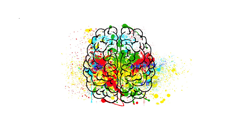
Colour In Marketing: Psychology of colour or colour psychology is the study of the effect of colours on human behavior and perceptions. Colorssymbolise certain emotions and can be used for subliminal messaging. For this reason, the psychology of colour in marketinghelps brands determine their course of action while promoting their products. It focuses on how certain colours impact consumers’ impression of a brand and how that can be channelised to persuade purchases. Every digital marketing agency and creative advertising agency evoke the emotional cues related to different colours to complement the content and communication for maximum impact.
Colours and Connotations
Colour contributes to visual appearance in a big way and a lot of consumers are drawn to the aesthetics of a product which ultimately translates to a purchase, a fact that is not lost to brands and advertisers. Here are some common colours used in branding.
RED
We see red being used by one of biggest brands like Coca Cola, Netflix and McDonald’s. People tend to associate red with movement, action, excitement, and passion. It represents characteristics like courage/bravery, boldness, action and passion. It creates a sense of urgency and is suitable for clearance sales and call-to-action buttons. Studies have also shown that red promotes blood flow, which in turn speeds up metabolism and increases our appetite, so we see it frequently used by fast-food chains.
GREEN
This colour is by and large used to represent nature and our relationship with it. It connotes wealth, progress, freshness, fertility, health, nature and environment. The colours of brands like Animal Planet, Big Basket, Spotify are green as they in some sense connect to these characteristics. It evokes a sense of calmness and stimulates harmony and balance leading to more decisiness. That’s why a lot of stores use it in their interiors, for instance Pantaloons.
BLUE
The cool tones of blue inspire loyalty, peace, trust, stability and wisdom. It is also known to promote productivity and curb appetite. Research shows that a blue storefront attracts more patrons than other warmer hues. A lot of conservative companies go for his colour when looking to promote trust and reliability. Brands associated with this colour are CITI Bank, Paytm and Facebook.
YELLOW
Yellow is usually connected with cheerfulness, joy, excitement, creativity, warmth and positivity. It is suggested that companies that want to associate with fast, pleasurable, and accessible products can benefit from using this colour. It depicts an approachable, friendly image and tends to draw customers with its warm comforting energy. Brands that use yellow as their primary colour are Snapchat, Maggi, McDonald’s.
PINK
Pink has always been associated with femininity and brands like Victoria Secret, Glow and Lovely, Barbie have heavily capitalised on it. The colour evokes emotions like gentleness, love, playfulness, affection. But with time, gender roles and identity have become less rigid and brands are starting to use pink beyond its association with femininity. For example, Dunkin Donuts and Instagram.
Context and colour
While it’s true that every colour can be made to represent certain qualities, perception and emotions are subjective. It would be ill-informed to use colours based on just their generic association to those characteristics. Where and how these colours are placed is equally important.
For instance, yellow is associated with creativity and happiness but it can also mean pale and sickly. It depends on what it is used and the other elements it’s placed next to, which creates the impact you want from it. Similarly white backgrounds with contrasting darker tones like black or navy can draw attention to particular features like logos.
Colour psychology in marketing is all about creating the maximum impression with the combination of tones and placement. Once a brand figures out the right combination for its products and services it can help catapult its marketing efforts by a significant measure.


